
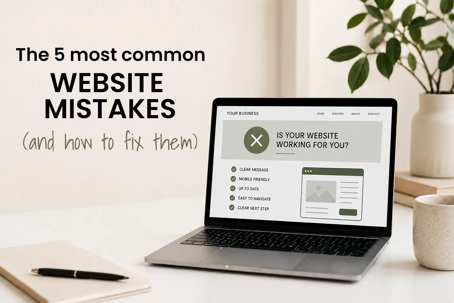
Most small business websites don’t fail because of one major problem. More often, it’s a collection of smaller issues that quietly affect how people experience the site, and whether they decide to get in touch.
The good news is that many of these problems are very common, and often quite fixable once you know what to look for. Here are five of the most common website mistakes I see small businesses make, along with some practical ways to improve them.
1. Unclear messaging
One of the biggest mistakes is assuming visitors already understand what your business does. When someone lands on your website, they should be able to quickly answer:
- What do you offer?
- Who is it for?
- What should they do next?
If the wording is too vague, overly clever, or focused on internal business language, people often leave before taking action.
How to fix it
Focus on clarity over creativity. Use simple headings, explain services in plain language, and make your next step obvious.
2. Treating mobile as an afterthought
Many people now visit websites on their phones first, yet often websites are designed mainly for desktop screens. Common mobile issues include:
- Tiny text
- Buttons that are difficult to tap
- Long blocks of text
- Layouts that feel cramped or broken
Even a visually attractive website can lose trust quickly if it’s frustrating to use on mobile.
How to fix it
Regularly check your website on your own phone, not just in a preview tool. Pay attention to spacing, readability, and how easy it feels to navigate.
3. Outdated content and information
An outdated website can quietly undermine trust. Things like:
- Old staff photos
- Expired promotions
- Broken links
- Incorrect business hours
- News sections that haven’t been updated in years
…can make visitors wonder whether the business itself is still active or attentive.
How to fix it
You don’t need constant updates, but small regular reviews make a big difference. Even updating a few photos, testimonials, or service details each year helps keep your site feeling current.
TIP: Schedule a quarterly website check
Add a recurring reminder every few months to review your website as if you were a new visitor. Check:
- Contact forms
- Links and buttons
- Mobile usability
- Service information
- Testimonials and photos
Small maintenance tasks are much easier than major catch-up updates later.
4. Focusing too much on design trends
Trends come and go quickly online. While modern design is important, some websites become so focused on animations, effects, or visual styling that they lose clarity and usability. For example:
- Text placed over busy images
- Excessive movement or animation
- Hard-to-read fonts
- Layouts that prioritise style over function
A website should feel professional and polished, but it should also feel easy and comfortable to use.
How to fix it
Prioritise readability, structure, and user experience first. Good design should support your content, not compete with it.
5. No clear call to action
Many websites forget to guide visitors towards the next step. If someone likes what they see but isn’t sure how to proceed, they may leave without making contact. A good website should clearly encourage actions without feeling pushy or overly sales-focused:
- Getting in touch
- Requesting a quote
- Booking a call
- Making an enquiry
How to fix it
Use clear buttons and natural prompts throughout your website. Make it easy for people to understand what happens next.
The bottom line
Most website issues aren’t dramatic – they’re small points of friction that add up over time. The good news is that small improvements can often make a noticeable difference to how your website performs.
A good website should feel:
- Clear
- Easy to use
- Current
- Trustworthy
- Straightforward to navigate
Perfection isn’t the goal. Clarity and usability are.
If you’re unsure whether your website has some of these common issues, I’m always happy to take a look and provide practical feedback on where improvements could be made.